Wallpaper Trends 2026: Colors, Styles & Aesthetics That Drive Clicks (and How to Create Them with AI)

by Imaginawalls
January 26, 2026 — 6 Min readWallpaper Trends 2026: Colors, Styles & Aesthetics That Drive Clicks (and How to Create Them with AI)
Wallpapers aren’t just “background images” anymore. They’ve become a form of self-expression—something people curate like outfits, playlists, or home decor. And that’s exactly why trends matter: when you publish wallpapers (or blog posts about them) aligned with what people already want, you naturally increase clicks, saves, shares, and organic traffic.
In this post, I’ll break down the most relevant wallpaper aesthetics trending in 2026 (from minimalist gradients to cinematic anime scenes), explain why they perform well, and show you how to recreate each trend using an AI workflow—my favorite loop: ChatGPT → MidJourney → DALL·E for clean, high-quality results.
If you run a wallpaper website (like ImaginaWalls) or create wallpapers for social media, this guide will help you choose themes that people actually search for and generate visuals that look “premium” instead of random.
Why Trends Matter for Traffic (The SEO + Sharing Effect)
From a traffic perspective, trends create three advantages:
- High demand: more people are searching for the same aesthetic keywords.
- Higher sharing rate: trendy visuals spread faster on Pinterest, Instagram, TikTok, and Discord communities.
- Better retention: users stay longer when they recognize a style they love (and often download more than one wallpaper).
That’s why trending categories are perfect blog content: you can rank for searches like “best wallpapers 2026,” “minimalist wallpapers,” “anime wallpaper aesthetic,” and more—while also guiding users into your collections.
Trend #1: Ultra-Minimal Gradients (Premium, Clean, Icon-Friendly)
What it is: Smooth gradients with subtle texture, light grain, and very little clutter. This style performs extremely well because it looks modern, doesn’t fight app icons, and feels “expensive.”
Why it gets clicks: It’s universal. It works on any device, any taste, any aesthetic.
AI Prompt Template:
ultra-minimal gradient wallpaper, smooth color transitions, subtle grain texture, soft studio lighting feel, clean modern aesthetic, balanced composition, 4K, icon-friendly, no text, no watermark, no logo
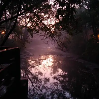
Trend #2: Dark Mode Cinematic (Moody Lighting + Soft Glow)
What it is: Deep shadows, controlled highlights, soft haze, and “movie lighting.” Often includes city lights, rain reflections, or fog.
Why it performs: People love dark wallpapers for battery life and readability. Cinematic dark scenes also feel dramatic and shareable.
AI Prompt Template:
cinematic night scene, moody lighting, soft volumetric haze, subtle bloom, high contrast, crisp details, wide shot, negative space for icons, 4K wallpaper, no text, no watermark
Trend #3: Neo-Anime Clean (Slice-of-Life Meets “Tech Mood”)
What it is: Clean anime-inspired illustrations with calm scenes: desks, city windows, night skies, rainy streets, soft neon, cozy vibes.
Why it performs: This aesthetic is extremely “saveable.” People keep it because it creates an emotional atmosphere (cozy, dreamy, nostalgic).
AI Prompt Template:
anime-inspired clean illustration, cozy night atmosphere, soft lighting, subtle neon reflections, shallow depth of field, calm mood, clean composition, 4K wallpaper, no text, no watermark, no logo
Trend #4: Nature Realism (But with Editorial Composition)
What it is: Photoreal landscapes that look like high-end travel photography: balanced horizons, clean foregrounds, dramatic skies, but not chaotic.
Why it performs: Nature is evergreen—but the “trend” angle is making it look editorial and cinematic, not just random scenery.
AI Prompt Template:
photoreal landscape, editorial travel photography style, balanced horizon, soft mist, cinematic lighting, sharp focus, high clarity, natural colors, 4K wallpaper, no text, no watermark
Trend #5: Abstract 3D Forms (Soft Materials + Modern UI Vibes)
What it is: Smooth 3D blobs, glassy shapes, metallic gradients, soft shadows—looks like modern product branding.
Why it performs: It feels “designed,” not generated. Brands use this look everywhere, so it feels contemporary.
AI Prompt Template:
abstract 3D shapes, soft matte material, subtle reflections, smooth gradients, clean modern design, studio lighting, minimal background, crisp edges, 4K, no text, no watermark
Trend #6: Retro-Futurism / Synthwave Revival (But Cleaner)
What it is: Neon sunsets, grid horizons, retro palettes—now trending again, but the modern version is cleaner and less noisy.
Why it performs: Nostalgia sells—and it’s instantly recognizable in thumbnails.
AI Prompt Template:
retro-futuristic synthwave landscape, neon sunset glow, clean geometry, minimal clutter, cinematic lighting, crisp details, wide composition, 4K wallpaper, no text, no watermark
Trend #7: “Quiet Luxury” Textures (Marble, Linen, Paper, Soft Grain)
What it is: Neutral colors, subtle texture, gentle shadows—like premium packaging design.
Why it performs: It looks elegant and timeless, and works perfectly behind app icons.
AI Prompt Template:
quiet luxury wallpaper, neutral palette, subtle paper texture, soft grain, gentle shadows, minimal design, premium look, 4K, icon-friendly, no text, no watermark, no logo
My “ImaginaWalls Approach”: Trends + Clean Usability
Trends are great—but for a wallpaper platform, usability is what turns a cool image into a downloaded image. My rule is simple:
- Always plan negative space (icons, widgets, clock area).
- Avoid busy micro-details that create visual noise on phones.
- Keep the subject readable even in small previews (thumbnails).
That’s why I often generate a set in MidJourney for style, then use DALL·E to explore cleaner alternatives with more controlled composition.
Quick Prompt Boosters (Specialist Keywords)
- “icon-friendly composition”
- “ample negative space”
- “clean background, minimal clutter”
- “subtle grain, premium texture”
- “cinematic lighting, soft haze, bloom”
- “crisp edges, high clarity”
How to Turn Trends into Blog + Collection Strategy
If your goal is traffic, don’t post trends as one big gallery only. Build a structure:
- 1 blog post: “Wallpaper Trends 2026” (this post)
- 7 collection pages: one per trend (minimal gradients, cinematic dark, anime cozy, etc.)
- Internal links: every trend section links to its collection page
- Weekly updates: publish 10 new wallpapers per trend category (keeps the site fresh)
This is the kind of structure that increases time-on-site, improves SEO, and creates a natural path from “reader” to “downloader.”
Tips for Better AI Trend Wallpapers
- Design for thumbnails: recognizable subject, clear composition.
- Use negative constraints: “no text, no watermark, no logo.”
- Make variants: desktop version (wide), mobile version (centered).
- Iterate one variable at a time: composition → lighting → texture.
And always remember: even the best AI tools can occasionally produce unintended or inappropriate content. If you're running a public-facing wallpaper platform, consider moderation and basic filtering—especially if users can upload images or submit prompts.
Next post idea (teaser): In the next article, I’ll show you how to optimize wallpapers for mobile vs desktop with exact resolutions, cropping rules, and how to design “icon-safe” compositions that don’t clash with UI elements.